
Skype for Android
One of the projects I looked after as part of the brand team was to work alongside the product designers on Skype for Android. The team was tasked with implementing Material design principles on our client, this meant a refactoring of the user interface and user experience to map closer to the native platform patterns and recommendations.
The way I explained what my intentions were branding-wise to the team wa using a dress code party analogy: we are going to a party where there is a strict black tie dress code, everybody will look the same so how are we going to showcase our personality? With small details, a cheeky dash of branding that shows up and then steps in the background again.
The starting point
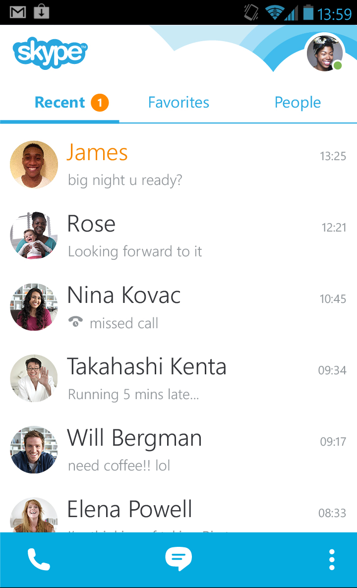
We had to transition from a visual language that, following up on the dress code party metaphor, was more like showing up in a disco ball tuxedo.
Aligning to Material Design
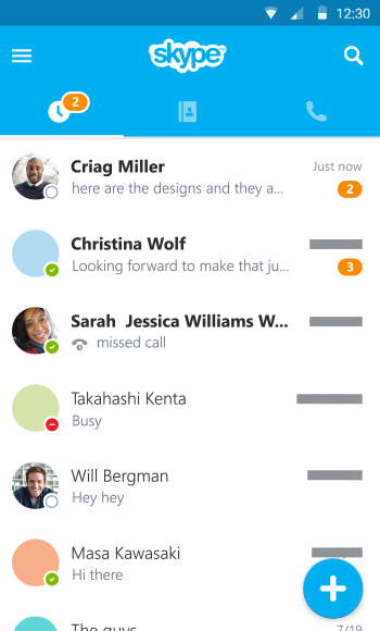
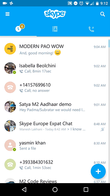
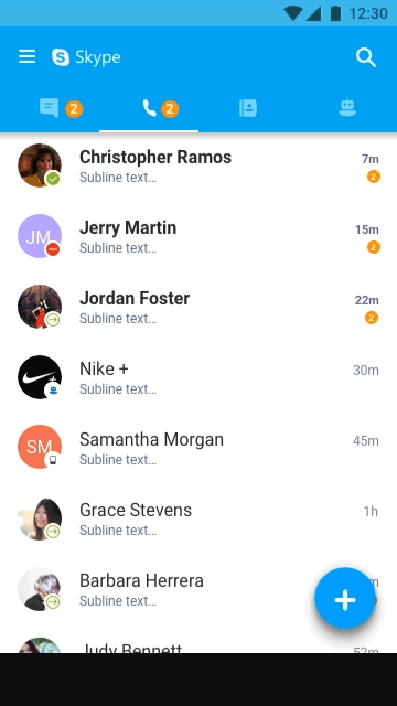
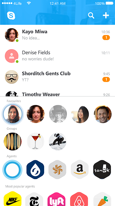
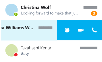
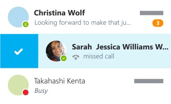
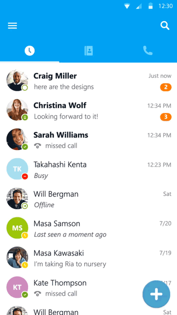
The team redesigned the app from top to bottom. The header design is probably the most notable change, now it features a hamburger menu to access the side bar hosting the user profile and links to settings and other sections of the client, search and tabs are also prominet in the header. The list views were enriched with quick swipe actions.
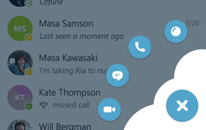
So far we were perfectly in line withe the OS guidelines (dress code), but we felt that we lost some of personality traits, our brand took a back seat and we were looking at areas in which we could bring this back. I thought that branding a native signature experience in a subtle way was the rigth approach. I directed my attention to the floating action menu (FAB), first of all, circular shapes have always been part of Skype's visual language, it also provided an opportunity in the transition between states that I thought we could leverage to promote some of our brand language, specifically the radial gradients and or the clouds, and our signature motion behaviours (i.e bounciness).


I designed and animated different verisions with different level of branding. One where the radial gradients are always on screen and they ar animated on scroll. One in which there is a hint of the radial gradients when the mask shrinks down to the FAB, the rest of the artwork is animated whn tapping on the +, and I also wanted to show how this area of the app could be used to showcase features, new emoticons, alerts and promotions.
This pattern has been used in the client for more than a year and half, it was dropped due to some concerns around the possibilty of labelling the items in the menu to be more aligned with Material Design patterns, although the philosophy of injecting some branded moments in the experience are still present like in the sign out flow.