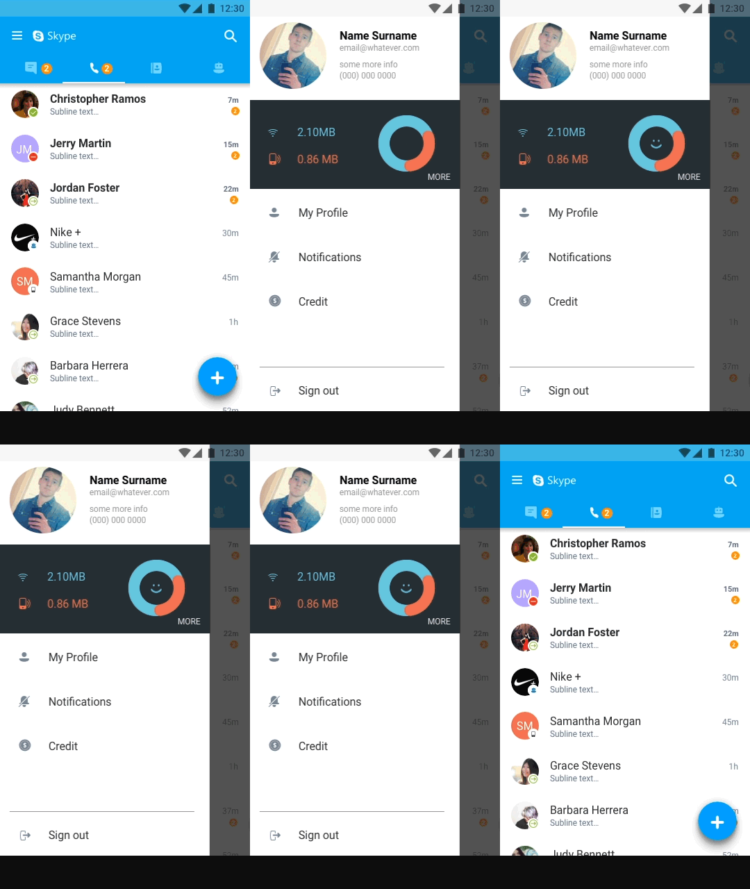
Skype IA envisioning prototype
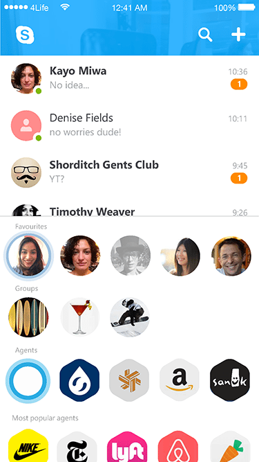
At the beginning of 2016 I was asked to look at a different information architecture model for Skype both from an interaction and visual standpoint. The brief was focused around the concept of three main panels that live at the top level of the app. The main content panel, in Skype's case it's the conversation list; the ancillary panel, an area to quickly access frequent contacts, groups, agents and recently shared content and the view finder, to create content.
Project objective



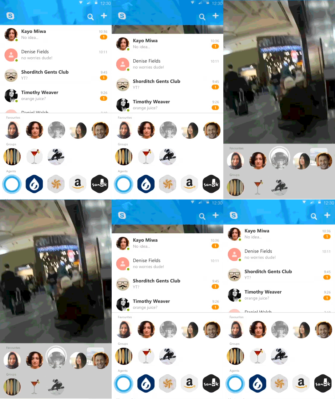

Some communication and social media apps in the market layout these panels horizontally and swipe through them horizontally. I looked at this from a different point of view and stacked one on top of the other.
There is less real estate dedicated to the conversations, at a glance you have a preview of your four most recent chats, the rest of the chats are half a swipe away, having a couple of vertical snap points helps going around this issue and we could use a "sticky" beavhiour i.e. if a user always exposes more conversations then the app learns to show more chats on launch reducing the acillary panel to the minimum height (but still on screen).
The second thing to look at is the header, in this concept the header doubles up in its functionality, it's a container for core actions Search and New conversation and it forshadows the presence of the viewfinder, it's always on and running in the backround providing a live texutre to the header, if this behaviour is too expensive in terms of device performance we could cut a loop as soon as the app is launched and play it to give the idea that something is live behind the header.
The ancillary panel in this case is intended to show frequent contacts, group conversations, favorite and most popular bots, it could also display active users and be repuporposed at a conversation level to show relavant contacts and bots contextual to the content of the chat as well as the shared media gallery.
Intercation
The main focus for this experience is around gestures rather than on screen call to action. Long press (or 3d touch) on a contact or a group avatar will open a custom overlay with a set of actions like call, video call, video message or ping an emoticon. Bots can have specific customized set of actions based on the services that they provide.
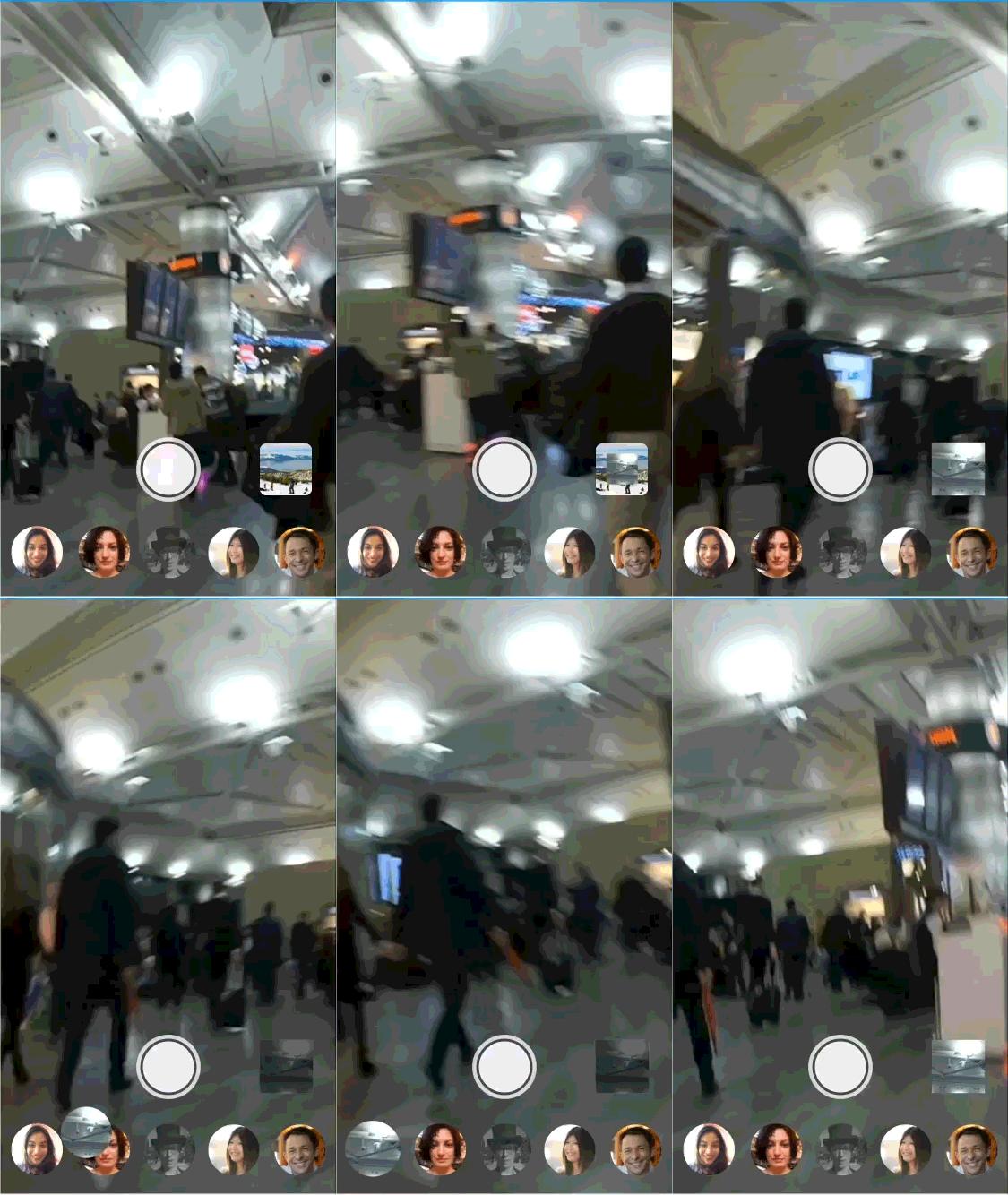
Tap, hold, drag and drop are interactions that I think should be considered in this prototype, it's not a frequent use pattern, at least on mobile devices and only at an OS level. It is one of the first humanized gestures in man-machine interactions to appear in the early days of GUIs. As an example In the viewfinder a user can tap, hold and drag the thumbnail of the last picture on top of the avatar of the frequent contact that remained on the screen after the user swiped down the main panel.

Chat canvas
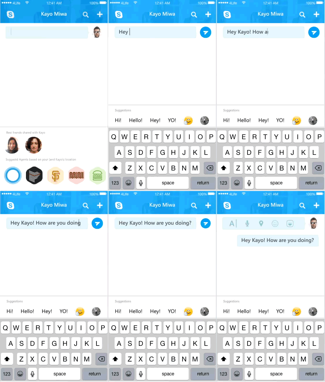

The vertical structure relies on swiping from top to bottom to reveal the view finder. When I started to look at the chat canvas I was challenged by the fact that swiping down scrolls the chat to reveal older messages, interestingly this is the only case in all mobile interactions in which the paradigm new is on top of the old, is flipped. Every single feed or list behaves following this model. So why is chat different from every other feed? I think that the proximity of the input field to the keyboard drove this. What would it take to revert this paradigm? How would this look and feel in every day interactions? We have several cases in which input fields are detached from the keyboard, think browsers and social media feeds, we now type on lock screens into input fields detached from the keyboard and it doesn't seem to concern the users. I approached this trying to free my mind from existing preconceptions. I tried to design a chat that follows this logic and allows me to leverage the two main peculiarities of this design: swipe down from the top to reveal the viewfinder and swipe from the bottom to reveal the ancillary panel or suggestion panel at this level of the app. This panel now takes a completely new role, it becomes an area that generates content for the chat and in this paradigm the keyboard is just another content provider!
Motion prototype
The product team deciced to explore other avenues specifically regarding the IA process however this excercize helped creating a good starting point and especially free the design team from the contrasints of the product's legacy

