


The MOO Shop
During my time at MOO.com the creative department was briefed by the Global Marketing Director to come up with some ideas to create the first retail space for MOO.com withing the popup mall Boxpark in Shoreditch where all the retail spaces are shipping containers.
Every designer came up with a bunch of proposals, everyone apart from me, I was the most recent addition to the team and although I started sketching ideas I didn’t want to disrupt the process within the group and I opted to listen and understand their ideas rather than show up with my own.
Long story short, none of the proposals were accepted so the board decided to give us a few more days to think about it. One day walking out of the office I approached the Creative Director and explained my idea based on one simple concept: what is the way in which our existing customers interact with us and which would be the way new potential retail customers would interact with us? That’s our website, moo.com
So here was the solution! We had to create a real life version of our website, existing users would be familiar with it and new customers acquired through the physical space would find it easy to navigate the virtual space. Using the same esthetic language we had to create a three dimensional environment, real, fun and engaging… exactly like everything that is MOO.
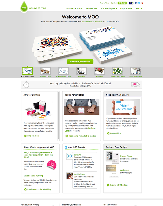
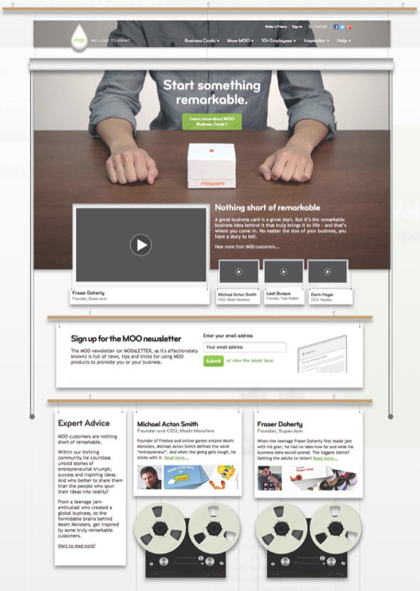
This was the homepage at the time:
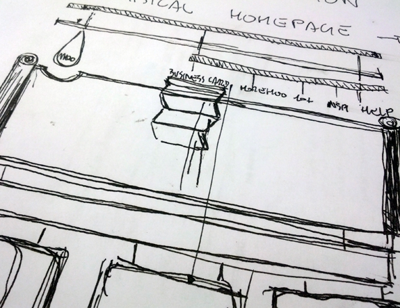
and this is the fist sketch I put together to lock the concept in my mind:
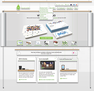
and this is a digital sketch I presented to the board:
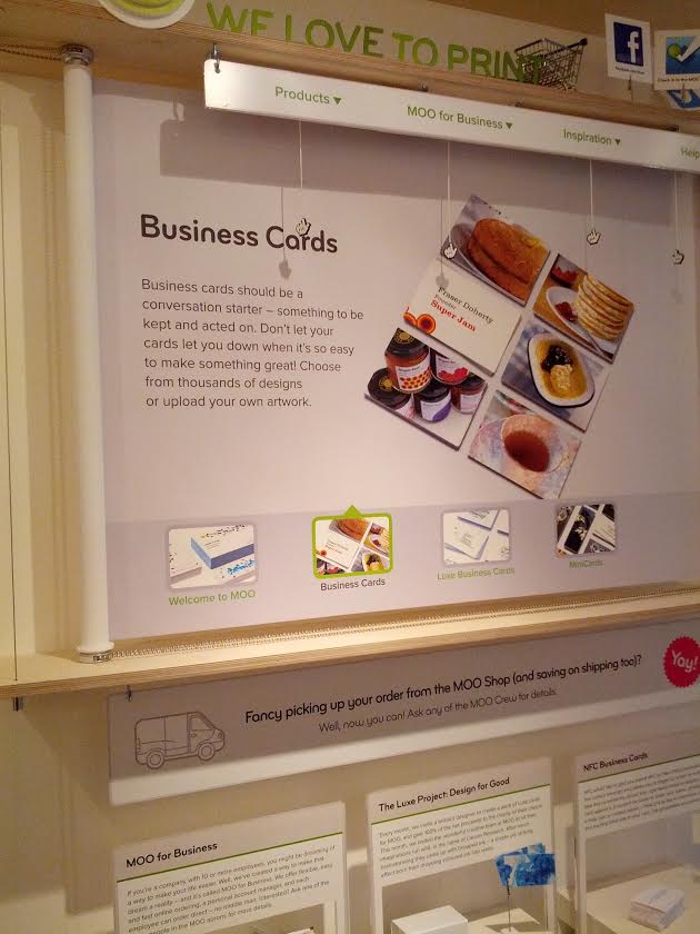
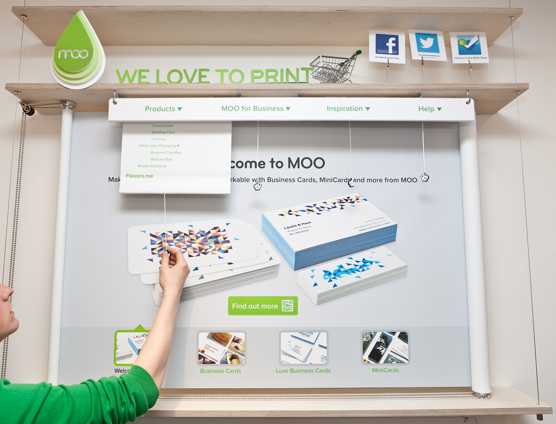
All the main elements of the homepage were recreated using a mechanical metaphor.
The slideshow works like a manual carousel, pulling the chains on the sides and the image will rotate horizontally, the dropdown menus were actual little drapes that pop down when the chord is pulled, the display panels used the same exact design as our website sections but had a cutout from which a shelf peaked out displaying the products. I actually created a little animation to explain the mechanism.
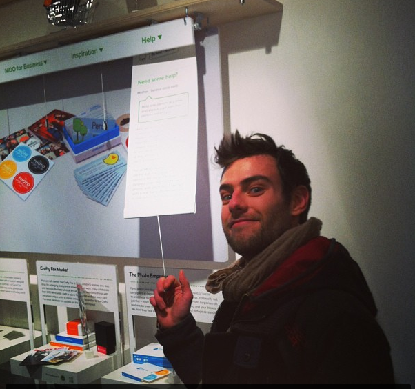
At this point the project was approved by the board and the entire creative team was tasked to work on it. We decided to identify the pages that we wanted to re-create in the shop: the homepage, the product page, the tv-ad campaign page, the accessory page and the inspiration gallery:
tv-ad campaign page sketch:
product page:
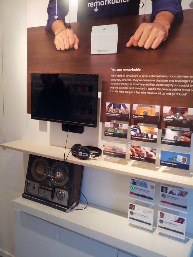
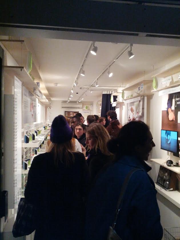
The campaign page worked exactly as in the website, just a bit more analogue: clicking on one of the printed video thumbnails played the clip in the TV screen cut out from the main panel, the audio of interviews with our most famous customers were played back by the re-wired reel to reel players.
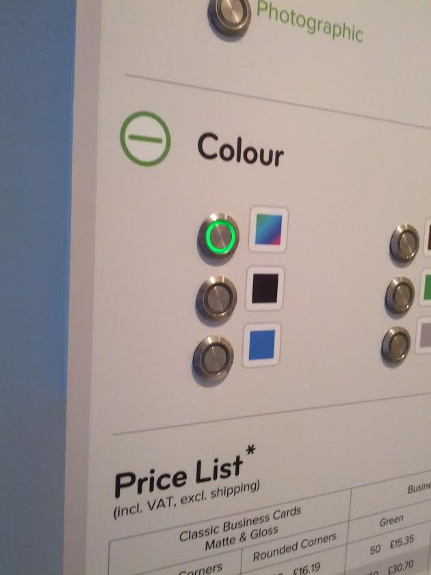
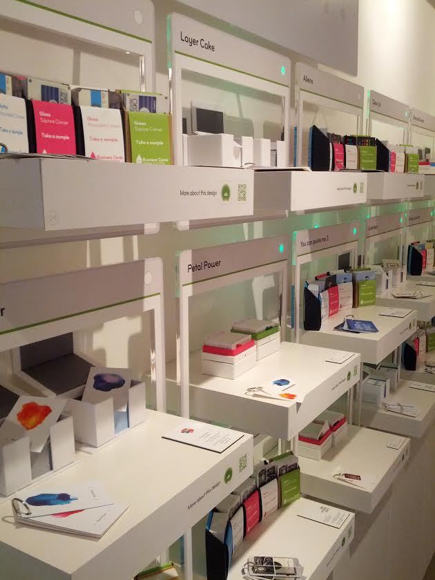
The product page worked, again, just like on the website. On the side bar you could select the type of paper, design and personalization by clicking on the radio buttons, and the correspondent shelves displaying the product would light up! We had to do a bit of work deciding which products and categories we wanted in the shop, marketing helped out here, the good thing about this system is that it could be updated easily from a web backend that we coded for this purpose (we the had to print new labels, but printing is not an issue for MOO).
and this is how it turned out: