


Mobile Feed
UI and UX model exploration
I was observing the swiping behaviour of some users during an A/B test, I noticed that the vast majority of the users swiped once to bring the content on screen and then tapped to stop the scrolling and focus on that specific photo or video. This got me thinking: how can we make this interaction more fluid, less convoluted for the user while ensuring content consumption and user delight?
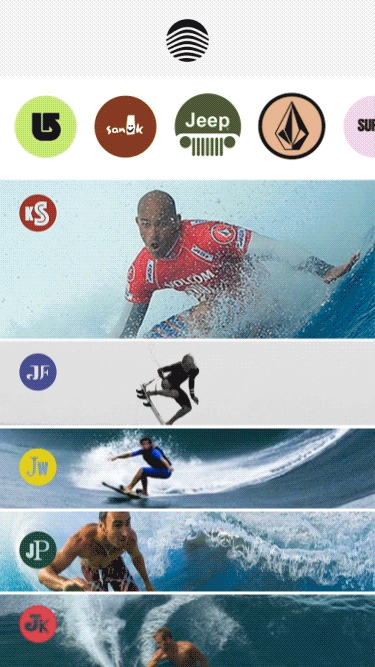
I designed and animated this mobile UI model to explore a different way to provide media content through a different type of feed mechanic, all while revealing as much content as I could, given the limited amount of vertical real estate, through a fluid and effortless interaction. The user is teased with a peak into what is next in the feed and, in a way, he is prompted to swipe to see more of it.
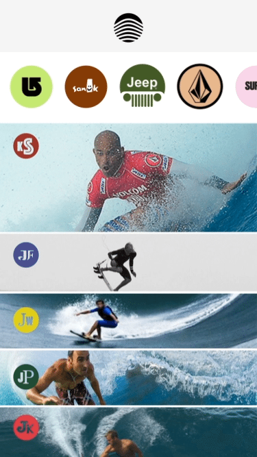
The new media format that was recently introduced by a number of mobile apps, the stories, lends itself to different type of feed models, this exploration could work as a summary, a peak into the stories that a user is following. In the prototype that I designed I thought of this as my surfing channel. The platform knows that I follow a number of surfers, they have published updates to their stories and the app gives me a little preview for each one of them, I can then tap on one and dig deeper in the content.